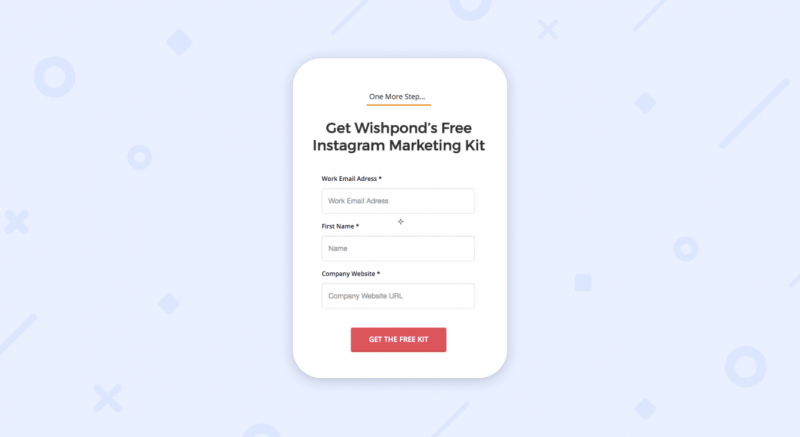
A popup is a great way to generate email subscribers for your business. A well-designed popup can be eye-catching and enticing to website visitors, prompting them to provide their contact information in exchange for free content or a discount on their first purchase. A good popup can also be a powerful tool to use for user feedback and tracking, encouraging visitors to give their opinions on your products or services.
The copy in a popup is the most important element, as it explains why visitors should sign up. Avoid using generic language such as “sign up for our newsletter” and instead create a compelling message that speaks directly to the value your emails will bring visitors. This could be exclusive offers, inspirational ideas, or other valuable content, which can help you build trust with your customers.
Choosing the right format for your popup is important, as it will determine how it appears on your website. For example, a full-screen popup is more invasive and may be intimidating for some users, while a lightbox popup can be less distracting and appear more inviting. Creating different variations of your popup for A/B testing will help you identify the best one for your audience.
For mobile devices, it’s particularly important to make your popup responsive and mobile-friendly. This means removing background images that will be difficult to read on a smaller screen and limiting the number of clickable elements to prevent distracting from the form itself.
In this popup from Body Bliss, the company uses a clear and simple message that appeals to visitor needs. They promote the perks of subscribing, such as free shipping, and use a colorful design to catch visitors’ attention. This is an effective way to increase conversion rates without compromising on user experience.
Another effective way to get more responses from your popup is by using a yes/no format, like this example from MeUndies. This type of popup utilizes the zeigarnik effect, which suggests that people dislike unfinished tasks and are more likely to complete them once they have begun. The yes option directs visitors to a new page to input their name and email address, while the no option closes the window.
Contextual popups are a great way to provide visitors with a reason to convert, especially on mobile devices. This example from Victrola shows a discount in action, which can be more convincing than simply a headline that asks them to subscribe. It’s also worth considering time-limited promotions, which can add a sense of urgency and drive conversions.
Using a “success” popup after visitors have completed an order can be a powerful way to thank them for their engagement and encourage further interaction with your business. This approach has been incredibly successful for this e-commerce retailer, which saw their conversion rate increase by 85% when they implemented a success popup.
A click event popup is triggered when a visitor clicks a Call-to-Action (CTA) on your website. These are particularly effective when used on landing pages, where they can be designed to target specific customers or segments of your audience.

